Citizens Solidarity Network
Citizens Solidarity Network is a non-profit organization that creates opportunities for people to connect, collaborate, and build stronger local communities. The visual identity was designed to reflect the organization’s mission while remaining flexible enough to adapt across digital and physical touchpoints.
Client
CSN
DELIVERABLES
BRANDING VIDEO ANIMATIONS LOGO BRAND GUIDELINES SOCIAL MEDIA WEBSITE
Year
2026
Role
CREATIVE DIRECTION BRAND DESIGN WEB DESIGN
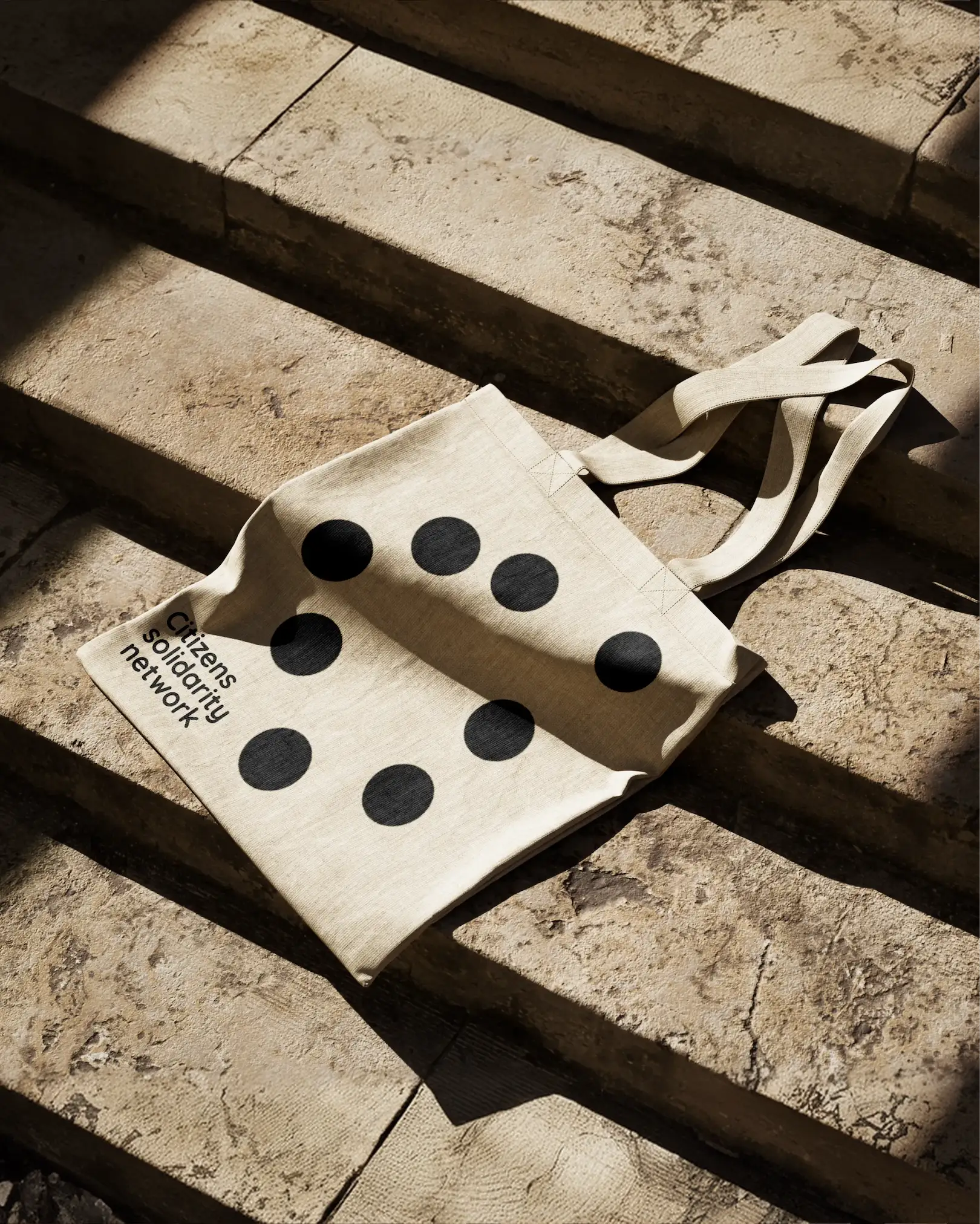
At the heart of the identity is a simple idea: a group of people gathering around a shared point. Seen from above, the logo brings individual forms together into a collective structure. Each element remains free to move and change position, while maintaining its connection to the whole, a reflection of how communities evolve without losing their sense of belonging.
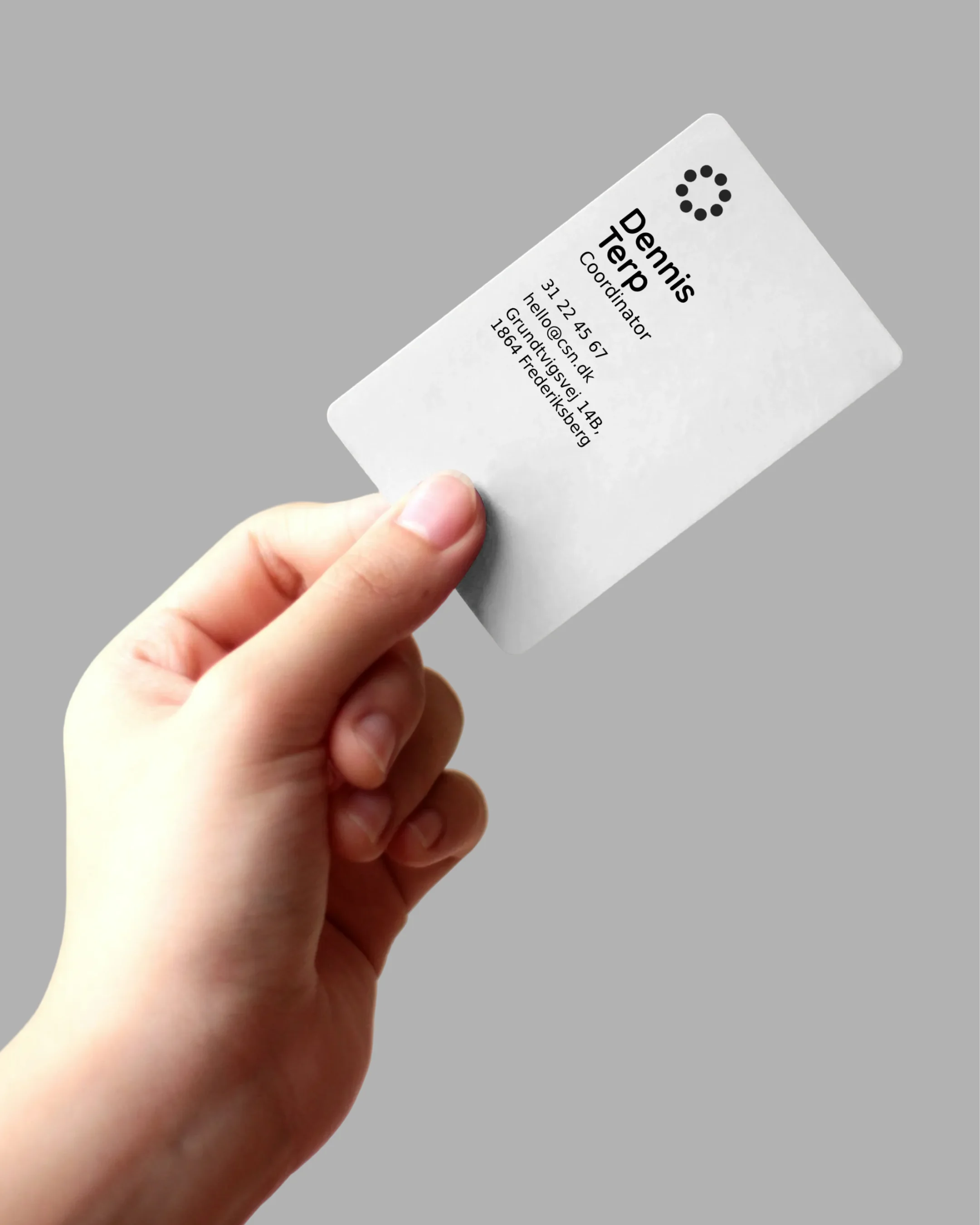
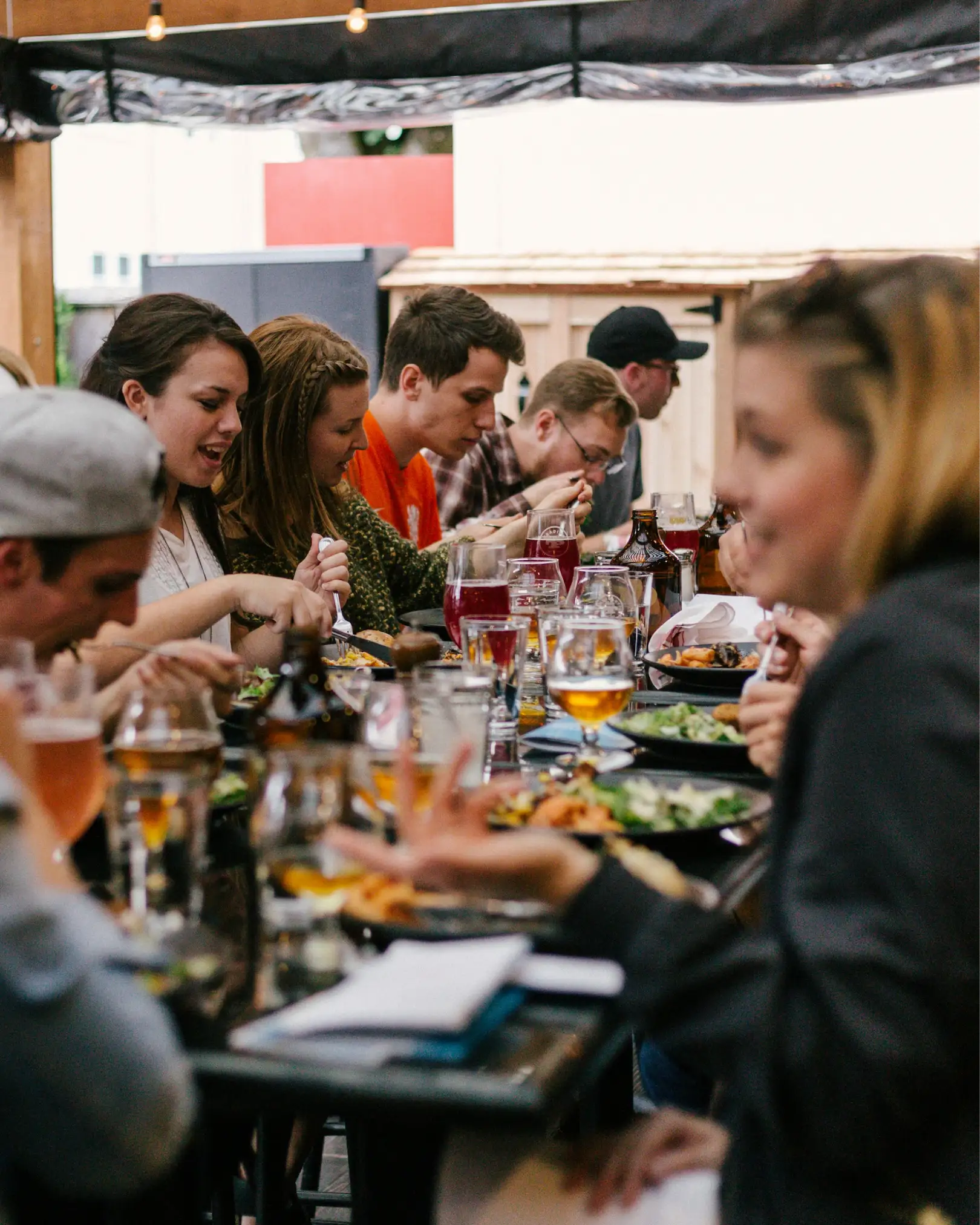
A neutral palette of soft greys and whites allows the identity to sit naturally alongside urban photography, creating a calm and timeless presence. Rounded typography adds warmth and accessibility, drawing on contemporary Scandinavian design to complement the circular forms and reinforce the idea of an open, welcoming community.
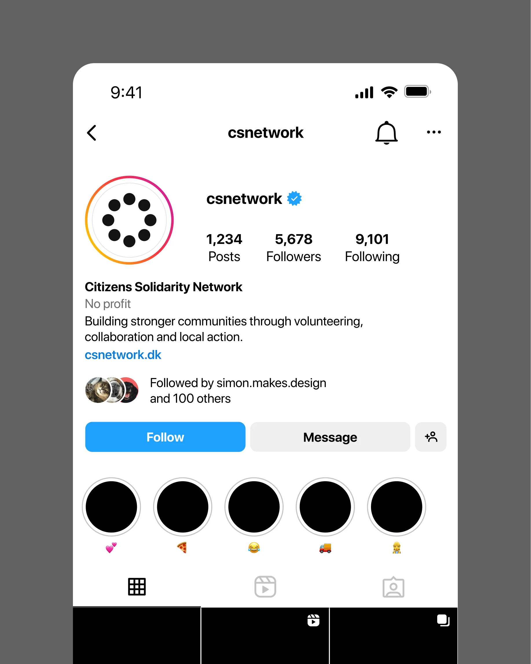
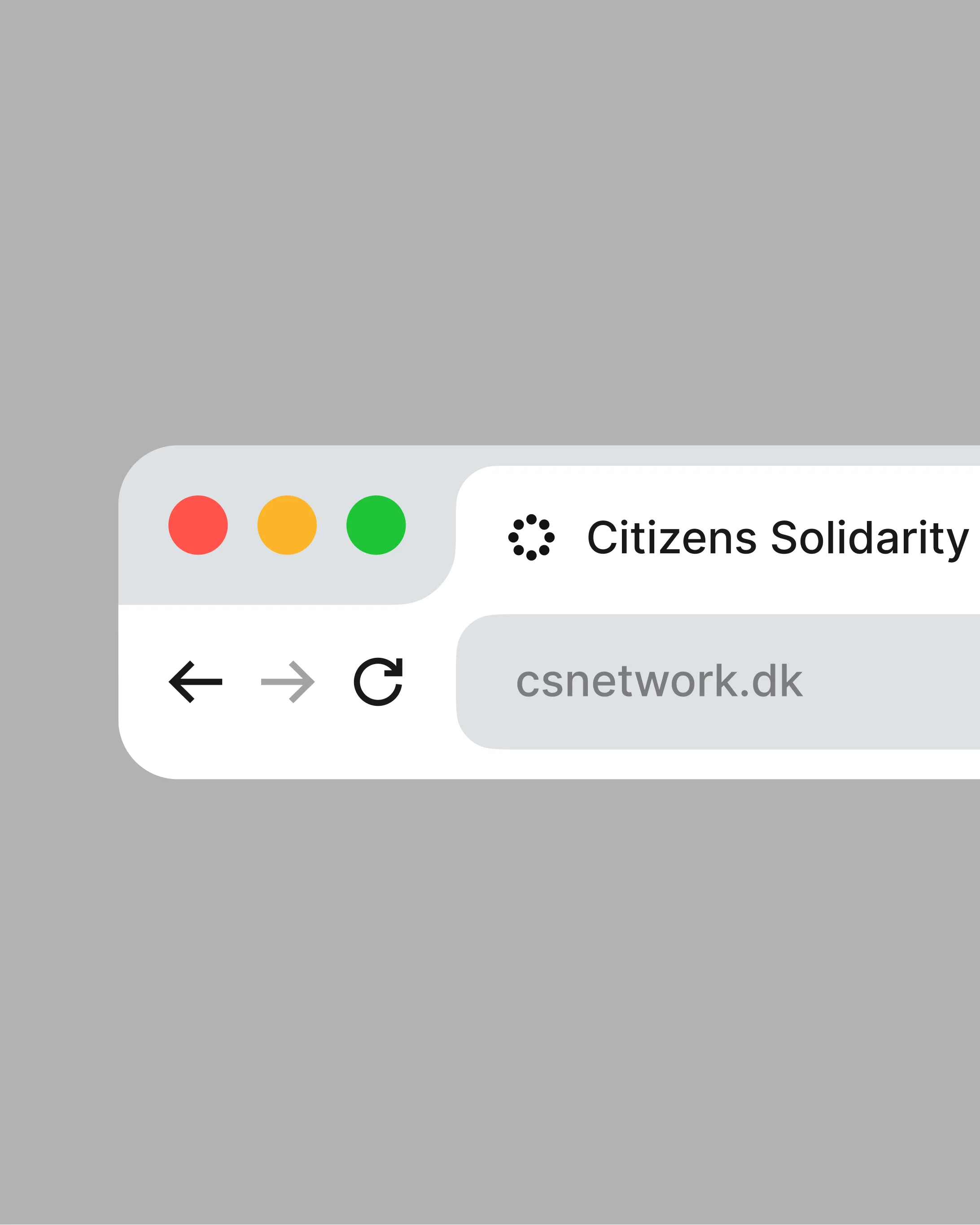
Together, these elements create an identity that is less about defining a community than giving it space to grow. A flexible visual system designed to bring people together, while allowing every individual connection to remain part of the larger whole.